|
|
Post by Monolith on Oct 13, 2006 19:44:24 GMT -5
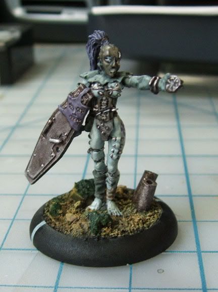
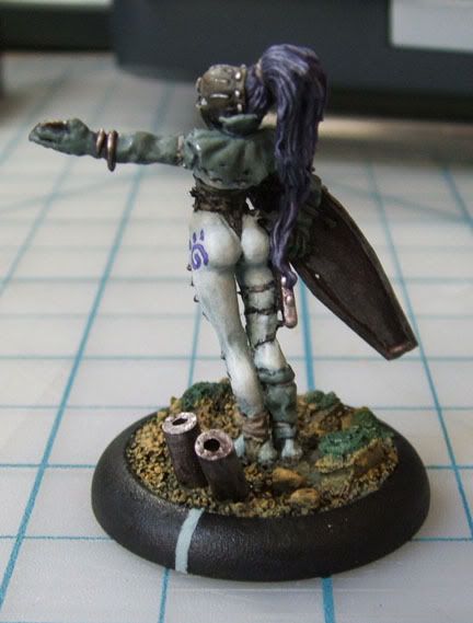
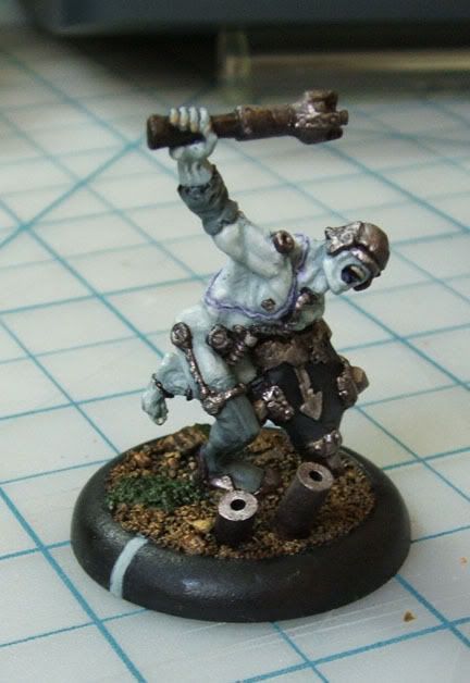
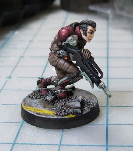
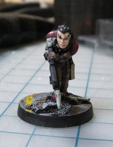
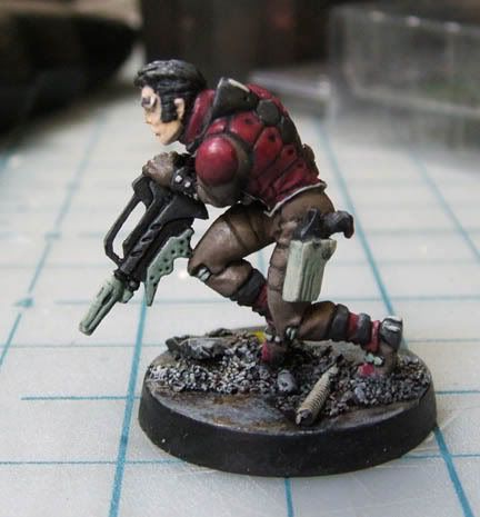
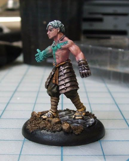
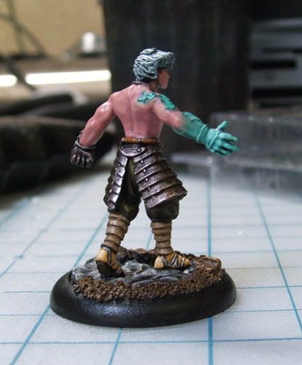
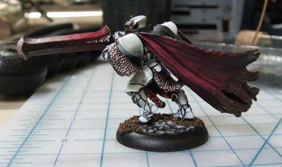
As some of you know, I like to paint little metal soldiers for use in a game I like to play. I've been doing a lot, and I've only recently gotten a camera capable of doing them justice. Note, I didn't sculpt any of these unless I say otherwise. Here are some pics with many more to follow: Raze: 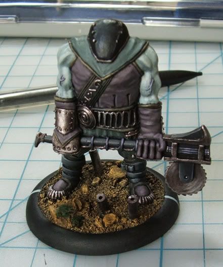 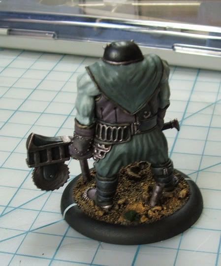 |
|
|
|
Post by Random on Oct 13, 2006 19:56:07 GMT -5
really don't like the sculpting personally, but it looks good
definitely wouldn't say its your best though
|
|
|
|
Post by Monolith on Oct 13, 2006 22:06:58 GMT -5
The sculpt is pretty decent, but very flat. As for it being my best, of course not, these are for gaming.
|
|
|
|
Post by Random on Oct 14, 2006 0:03:37 GMT -5
the flat bit is probably why it looks bad to me, just looks like someone took a brick and kept the shape while turning it into a mini
that and it looks really rigid
|
|
|
|
Post by dietspam16 on Oct 14, 2006 0:41:52 GMT -5
Definitly don't like the pose, but the style the seem to be going for is fun, what game is that? And I think the paint job really helps the model, kudos
|
|
|
|
Post by Monolith on Oct 14, 2006 13:42:34 GMT -5
The game is Dark Age, which I've been dragged into. It's a great game and one of the cheapest to play (the above was about $13, and the base is 2" in diameter to give a sense of size). Also, if the model looks like one big chunk, that's because it is. It's solid metal.
|
|
|
|
Post by Arachis on Oct 15, 2006 23:42:32 GMT -5
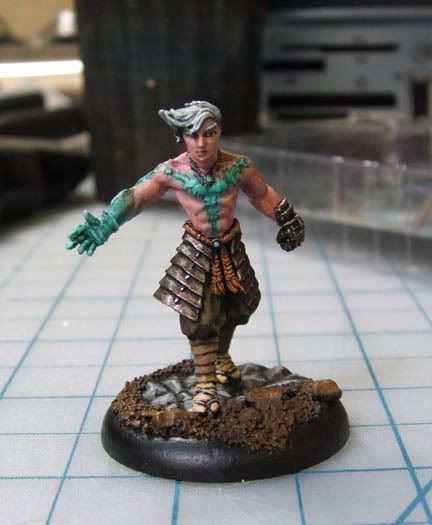
not bad. Ive always liked nicks painting and this is no exception. Nick you want to give me painting lessons? I can draw ok but I suck balls at painting.
Anyway, as alex said it might not be his best but the painting definately turns what might have been a kinda bland looking minature into a more interesting piece. The model lacks activity and energy in my opinion (I think nick knows what I mean). I feel like it could be even more interesting if you painted some kind of designs onto his head to add some more activity to the model. But then again, that might detract from how hes supposed to look. Anyway nice job again nick.
|
|
|
|
Post by Monolith on Oct 16, 2006 14:04:43 GMT -5
|
|
|
|
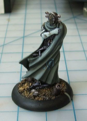
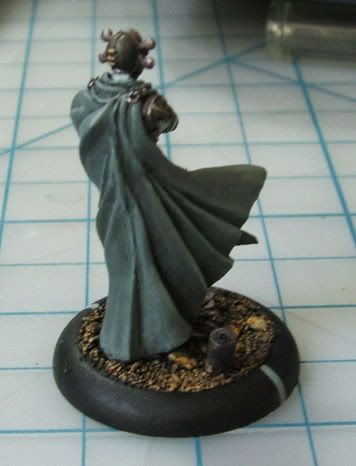
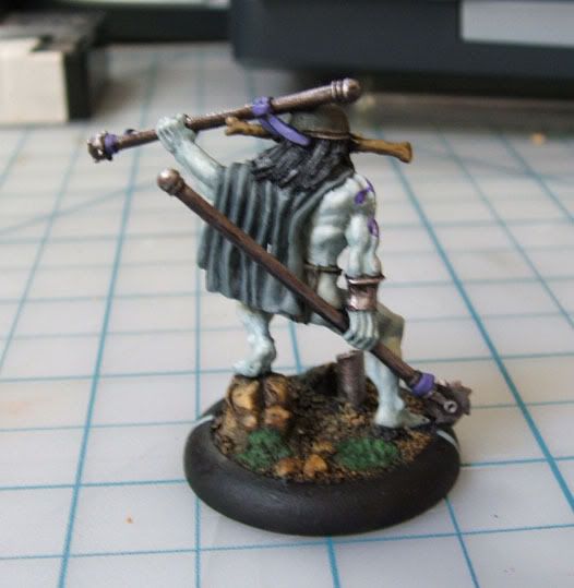
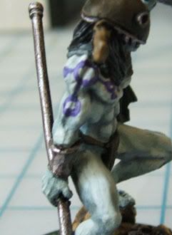
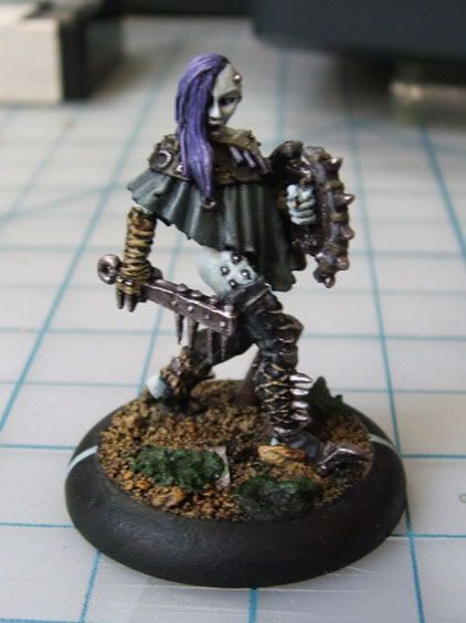
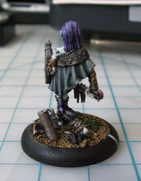
Post by Random on Oct 16, 2006 15:07:07 GMT -5
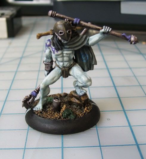
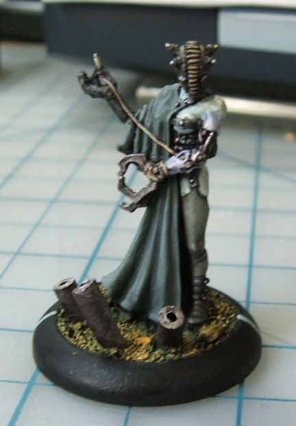
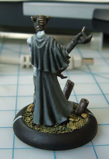
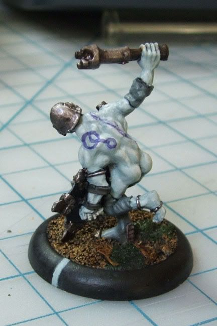
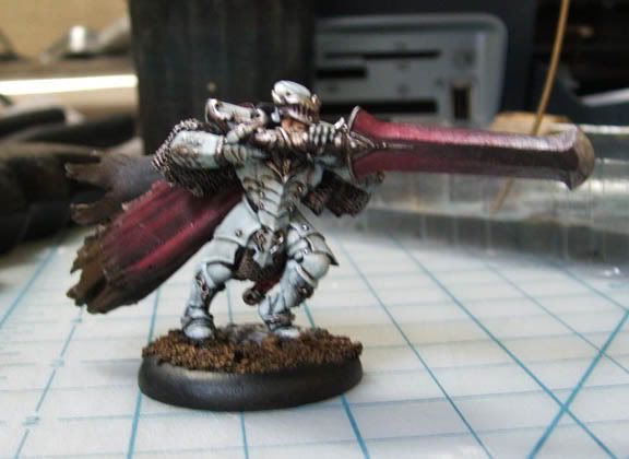
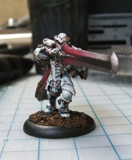
for some reason, except for the third picture, those look slightly out of focus
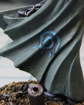
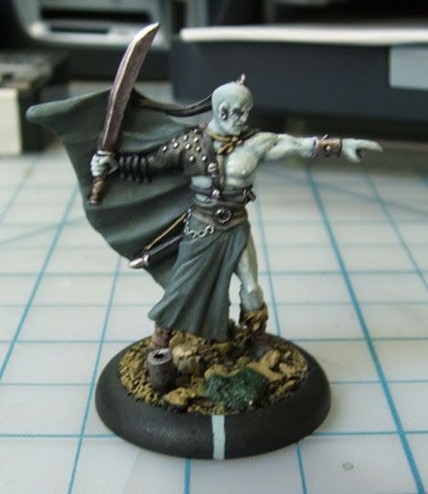
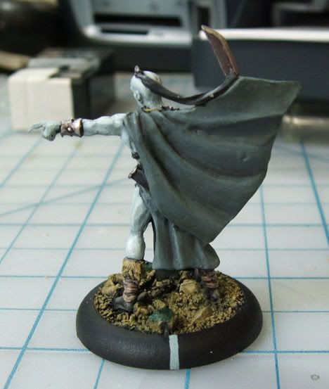
at any rate, I like the first one, only thing I'd do differently (if I could actually paint that well) would be to either have the design on the cloak be bigger or have more than one design, probably on the back, since that side is lacking much beyond highlighting and the like
personally, I hate the second one. its not that the painting is bad, just, the model is. . . well. . . ugly to me, and nothing really catches my eye
I like the third one probably the most out of the three, I think its got a good amount of purple and the lighter brown in there, which to me are the only colors that aren't. . .I guess I'd say dull/muted, though I'm not exactly sure I'm using those terms correctly, but either way you probably get what I mean
|
|
|
|
Post by Evilduck on Oct 16, 2006 18:04:09 GMT -5
It is very hard to take close up shots of things, especially something small like a miniature.
I like the ground on the second model, and the highlights for the muscles came out nice.
|
|
|
|
Post by Monolith on Oct 16, 2006 18:32:52 GMT -5
The reason those look a bit blurry is not because they're out of focus, but because one of the downsides to my new camera is the rather slow shutter speed. In other words, the camera is moving ever so slightly as the picture is being taken since I have shaky hands and the camera is so close to the subject. I would have taken multiple pictures, but the memory card the camera came with is a whopping 16 MB. In other words, I can have at max about 16 good quality pictures on there at once. I've ordered a 512 MB card just a few minutes ago because it was only about $20. Once it gets here I'll take some pics of the school too to show you all the awesomeness that is CSULB. personally, I hate the second one. its not that the painting is bad, just, the model is. . . well. . . ugly to me, and nothing really catches my eye Ironically, there was recently a newer version of that miniature released because the original was so unremarkable (not to mention far too large). I just happened to have that one anyways. The freehand on the other's cloak is a bit too small, and I'm probably going to improve it later. I don't want to touch the back because the cloth there is so poorly sculpted. Seriously, I've done better. |
|
|
|
Post by Evilduck on Oct 16, 2006 18:59:29 GMT -5
I like having a camera that lets me control shutter speed and aperature, even though I have an old school film camera and not a nice digital one.
I would suggest somehow putting your camera on a stable surface. This might be hard without a tripod, but you can manage it through creative use of books and slanted binders (binders saved my life in Photo 1)
|
|
|
|
Post by dietspam16 on Oct 16, 2006 20:49:39 GMT -5
I really like older cameras with more control, they're alot more fun to use and can be much more accurate
|
|
|
|
Post by Arachis on Oct 17, 2006 2:08:03 GMT -5
Id like cameras with more control too if I knew how to control them.
Anyway, I actually like the first model of those three the best. I think the empty space around the symbol makes the symbol stand out more and makes the model more interesting than if it was bigger or if there were more of them.
|
|
|
|
Post by Monolith on Feb 17, 2007 17:15:21 GMT -5
|
|